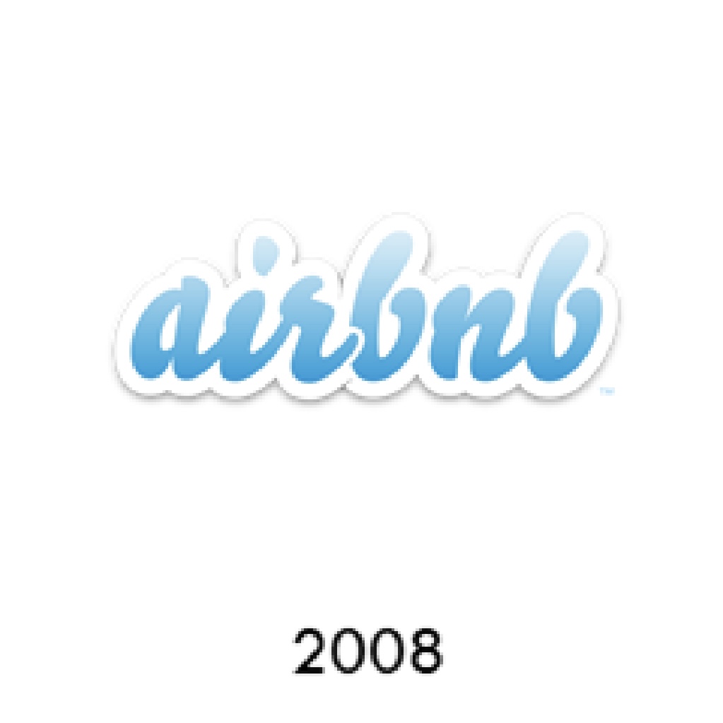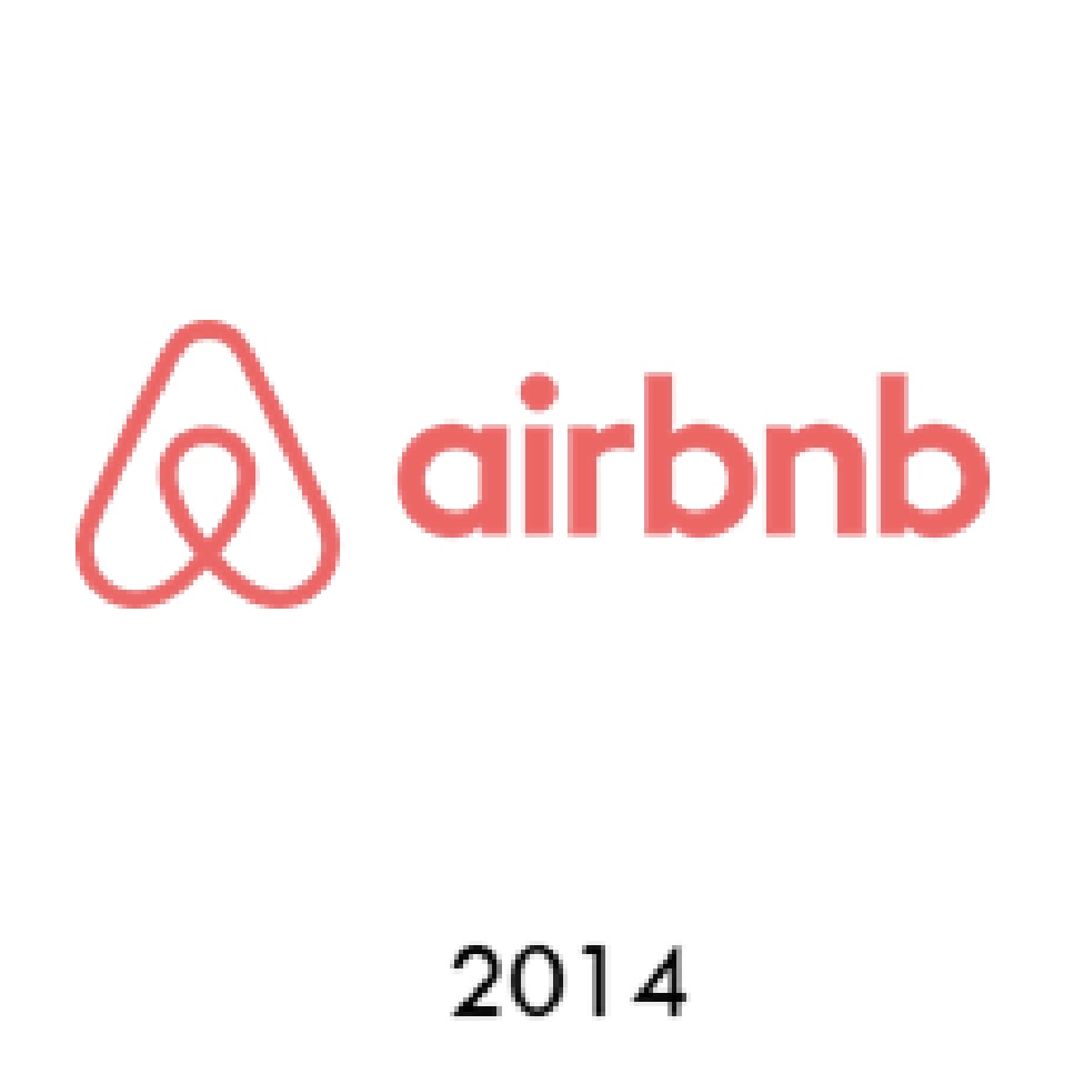

The evolution of AirBnb logos over time:


The evolution of Airbnb's logo design is also a success story of minimalist design. The earliest Airbnb logos used complex fonts with gradients that, while stylish, failed to communicate the brand's core values.In 2014, Airbnb underwent a major rebranding with the introduction of the new Bélo logo. The logo is a simple geometric shape that symbolizes four core ideas: people, places, love, and sharing. Through this abstract symbol, Airbnb not only communicates the global connectivity of its brand, but also reinforces its brand identity as a platform for the sharing economy.Bélo's minimalist, flat design, stripped of intricate embellishments and details, ensures a clear presentation on mobile and digital platforms, while reinforcing the brand's sense of belonging and openness.