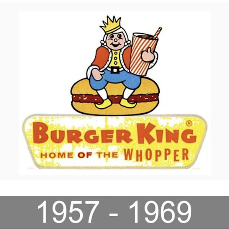
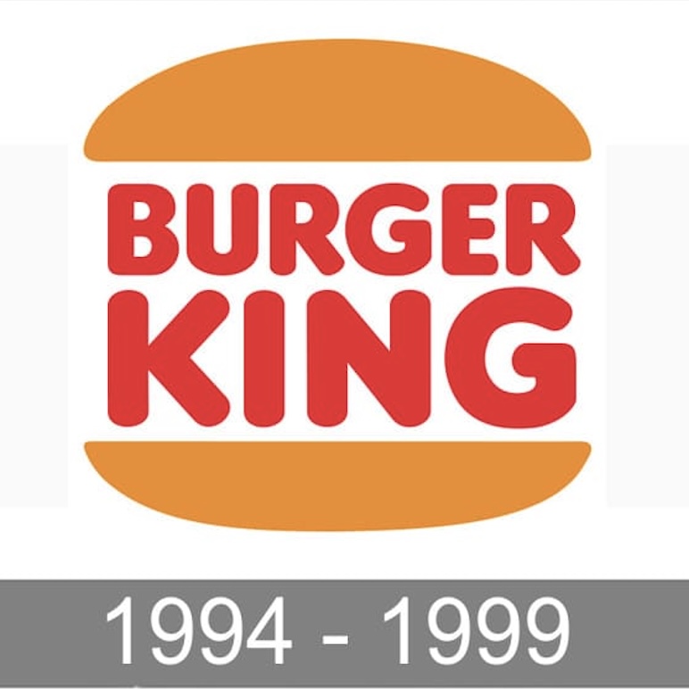
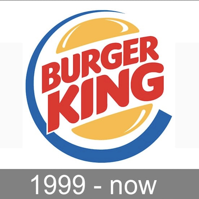
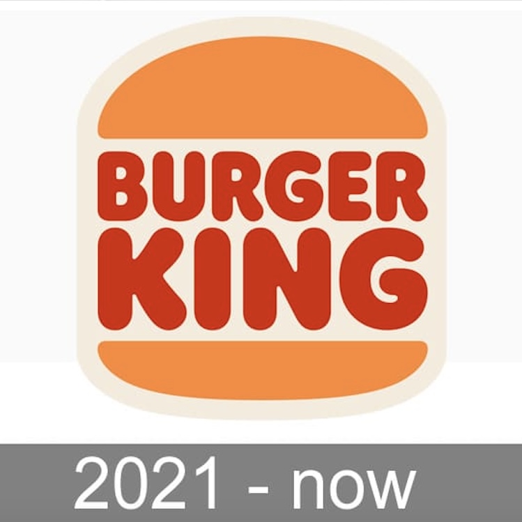
The evolution of Burger King's logos over time:


The Burger King logo design underwent a significant change in 2021. The update returned to the classic 1969-1999 style with a cleaner, more modern design language. The old logo featured the gradient, 3-D effect and blue circle introduced in 1999, but as design trends changed, the complexity of the design no longer seemed digitally appropriate. In keeping with today's flat and minimalist trends, Burger King's new logo removes gradients, shadows and intricate details and goes back to simple text sandwiched between burgers.