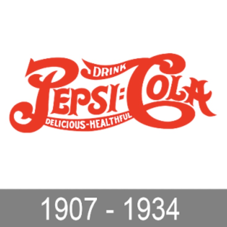
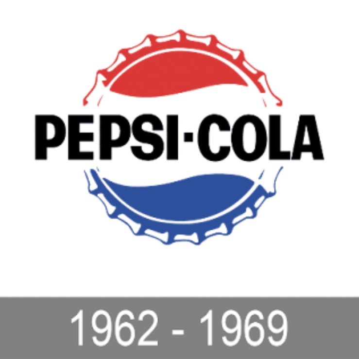
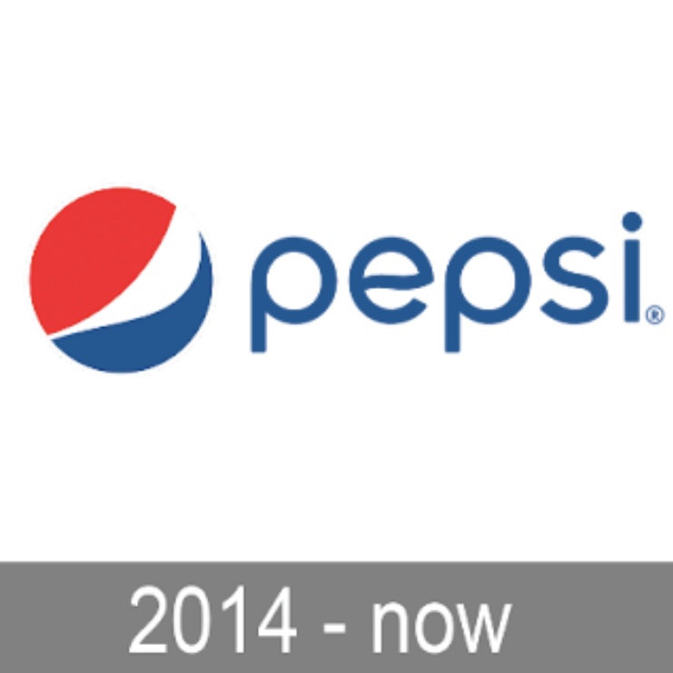
The evolution of Pepsi logos over time:


Pepsi has made several adjustments to its logo throughout the history of its brand. The earliest logo designs contained detailed text and intricate graphics, but over time, the Pepsi logo became progressively more rounded and minimalist, with brighter and flatter colors. The latest logo maintains the red, white, and blue colors, but is presented in a cleaner curved and sans-serif typeface, a change that enhances the brand's modern feel while maintaining Pepsi's signature color elements.